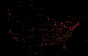
 A new project by social media data provider GNIP maps more than 280 million tweets published from mobile devices in the U.S., showing patterns of use that few people have ever laid eyes on before.
The map lets you display the tweets selectively, so you can see which kind of device posted them and where. The Wall Street Journal’s MarketWatch blog makes a connection between Android and iOS use and affluence in areas shown on the map. They see Android devices being heavily used in areas known to be poorer, while iOS devices are used primarily in richer areas.
Does this pan out? Well, a look at the map for Bozeman, an affluent city, shows that mobile tweets posted from here are overwhelmingly posted via iOS devices. The map for Billings, a less affluent city, shows mostly Android devices in use (and far fewer tweets). It’s not a scientific result, but it does seem like a trend — if you believe that Android phones are the poor man’s smartphone, and a case could probably be made for that.
Whether you believe MarketWatch or not, the map makes fascinating browsing.