Every six months or so, I get the inkling that it’s time to redesign the Chronicle’s website. Today was the culmination of another of those inkling periods.
I flipped the switch on a new look for the Chronicle today, one that I think makes it easier for readers to find what they are looking for, whether is by menu, search or by simply browsing the pages.
Let’s run through the highlights.
###Rebuilt from the ground up
I took the old header, trashed it and built a brand new one that takes advantage of the Bootstrap grid system, rather than the default grid system that came with our site. Both grid systems worked fine, but Bootstrap grids are easier to customize and are easier to tweak if changes need to be made.
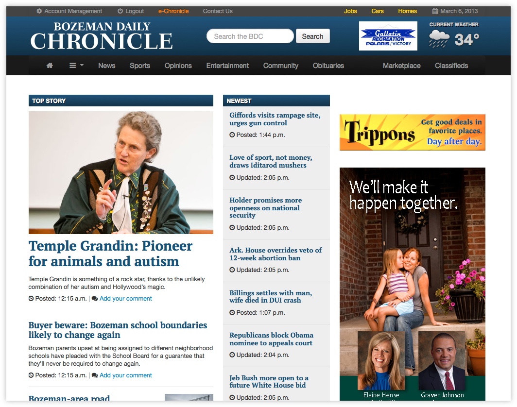
###New feature: Top bar
We previously had some navigation elements above the logo of our website, but now that element has been improved. It is now set off in a dark gray color and includes more useful links right where they should be: highly visible at the top of the page.
When you’re logged out, you’ll see a link to log in or to subscribe if you have not yet joined the faithful. When signed in, you’ll have direct access to manage your BDC account, logout or go straight to your e-Chronicle subscription.
We’ve also placed gold-colored links to the most commonly browsed sections of our classifieds in this bar for easy access.
###Search back up top
My grant experiment with placing the search bar in a floating menu at the bottom of the page was a valiant one, but ultimately it failed.
I got one or two calls a week from people who thought we had disabled search on our site or that we didn’t make our archives available. When I would direct them to the bottom bar and its search form, I could hear them slap their foreheads through the phone and say, “Of course, it’s right there!”
However, it should have been right where they were looking for it, right where 95 percent of websites keep their search bars — at the top of the site.
Rest assured, as long as I’m around and as long as it remains a staple of Web design, the search bar will remain at the top.
###New weather icons
I replaced the weather icons will all new ones. The old ones, which were the content management system’s default icons, hurt my eyes to look at them. These are prettier and easier to read.
###New menu
Previously, we used what is commonly called a “mega menu,” one that has super wide menus that contain all sorts of content, kind of like a website within a website.
However, that made the navbar itself a destination that was distracting people from the content actually on the page, and with the complexity of the mega menus, I’m not convinced it was making it easier to find anything.
The new menus are standard dropdowns with submenus, familiar to anyone who has used a computer in the past 30 years. They include all the options that were there before, organized in what I hope is a rational way, along with a few icons for visual cues.
One thing that always bugged me about the menu was that it had a “home” menu. To my mind, the “home” feature of any navbar should be a link to the homepage, not a menu to collect random things that have to do with the site — contact us, about us, staff directory and that sort of thing.
To that end, we included a simple menu button with an icon that should be familiar to most modern computer users. Under here, you’ll find all that site-related stuff, as well as a way to log in and log out, manage your account and reach your e-Chronicle subscription.
One more thing: Scroll down, and you’ll notice the navbar sicks with you as you move down the page. So you see, I stuck with the sticky menu idea somewhat, though in a more useful way than before.
###New section titles
Our section titles have been retooled to stand out more to the eye with a blue gradient background that matches our header. The old section titles, red text with an underline, were not visible enough.
###Reorganized homepage
The homepage has been reorganized to put the content people are after where they are going to see it. Since the layout of the homepage changes fairly often, as seasons change and as features come and go, I won’t go into too much detail here, but feel free to explore.
###New headline font
Just because it looked nice.
###Reworked search results
I also did some work on the search results to make them a little more viewer friendly. The results should look a little nicer when you’re searching for images, and the other results should provide a little more relevant information in a more readable format than before.
###And that’s about it
It’s all over but the tweaking. Feel free to let me know what you think of the cosmetic change.
Now if you’ll excuse me, I have to go start planning the next redesign.