Let’s talk about fonts for a minute. I’m in the middle of redesign work for a couple of sites, including the Chronicle, which is going to get a facelift in a couple months. The question I have for you is this one: serifs or sans-serifs?
You font nerds out there — who also happen to read the paper online — already know that we use a font stack that looks something like this:
font-family: ‘Helvetica Neue’,Helvetica,sans-serif;
 This means that the majority of our viewers on OS X will see us in some form of Helvetica since that font is installed on Apple computers out of the box. Many on Windows platforms will view us in Arial or some such sans-serif.
The stylesheet is set to give the headlines a line height of 1.125 ems, which I feel is a good line height for that font at most headline sizes. Headlines are rendered in #29527a, in case you wanted to know the precise color we use.
For me, right now, that means the top story headline on the Chronicle site winds up looking something like the picture on the left. Your browser and OS’s rendering of the headline may vary.
The real question at hand is whether to move to a serif headline font. And if so, which one to use. Most news websites out there us a serif font in some capacity, whether it’s the body text or the headlines. Serifs just make the type look newsier, and I think we’re going in that direction for the Chronicle (newsier font, that is, for all you jokers who would say that we’re headed toward newsier content).
Plus, I think a font change shows the reader that this is a significant visual update. It will cue them in to be on the lookout for other changes made to the site without us having to explicitly tell them what has changed — at least not in some sort of lightbox popup or modal dialogue or what have you.
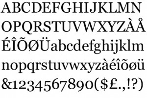
My options for a serif font have so far been pared down to two: Georgia and PT Serif.

Georgia is great because everybody has it already. It’s installed by default on both Windows and Macs, meaning the site’s going to look similar on both platforms. You can read all about Georgia here, including the fact that it was designed specifically for the computer screen, which makes it a very suitable typeface for digital applications.
The downsides to Georgia are that everybody uses it and that it displays numbers so that most of them hang beneath the baseline. This can look weird.
PT Serif, on the other hand, is available from Google and other online font purveyors for free. It has a little bit different feel that Georgia, and it’s a tad bit more readable at smaller sizes. Plus, it doesn’t hang the numbers beneath the baseline. (I have converted the headlines of this blog into PT Serif for the moment.)
Downsides are that it would either have to be pulled in from Google or Typekit or it would need to be embedded on the site. The first option slows down loading of the page and might hit snags on older browsers. The second option is just another thing to add to my to-do list.
So, that’s all I have to say about fonts right now. We’re going to serifs, but I don’t know exactly when or exactly which font. I welcome your input and suggestions for other potential fonts that I could look at. Leave your suggestions in the comments or get in touch with me at becker@dailychronicle.com.